Beer Can Label Design
Label Design
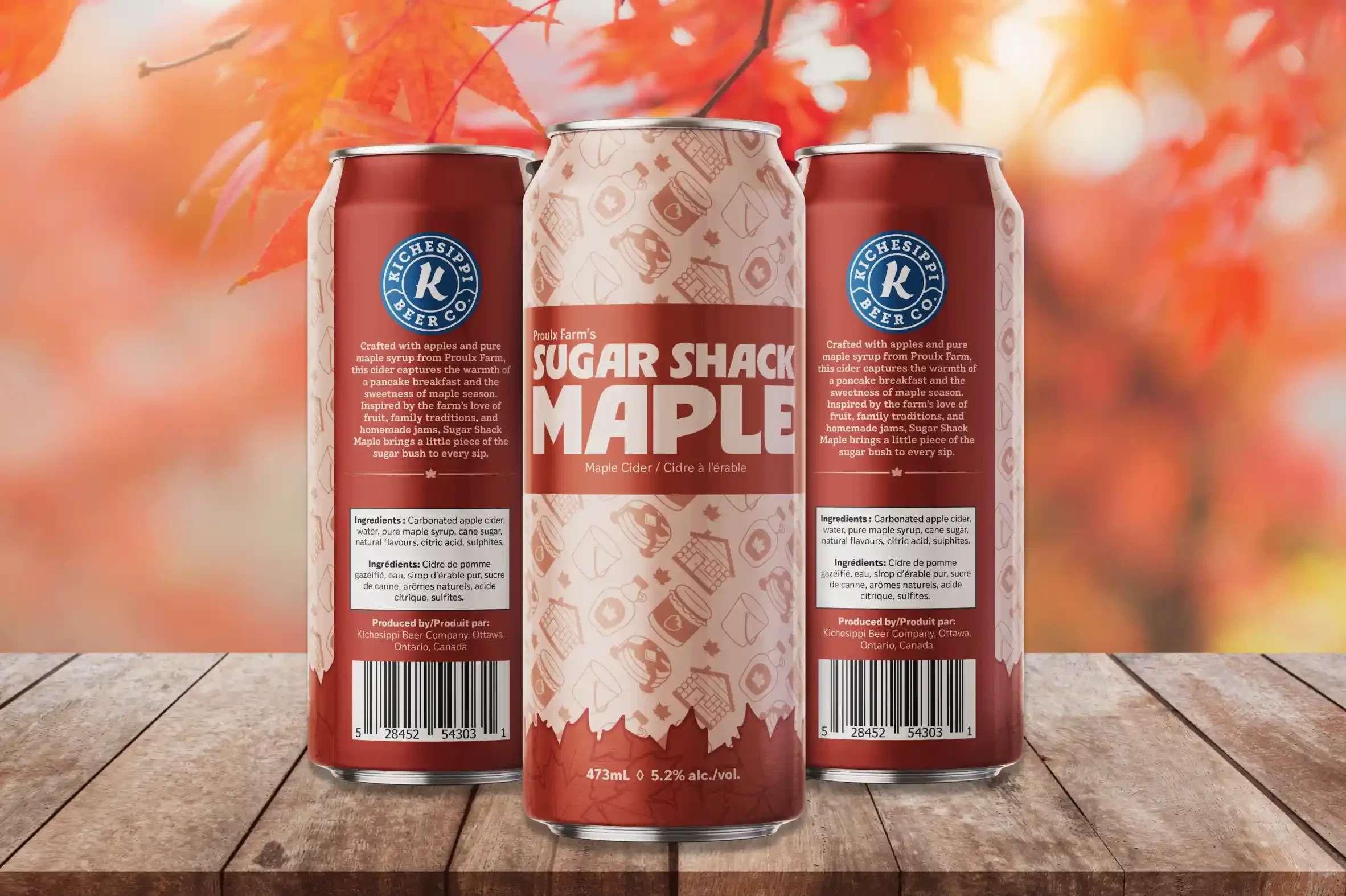
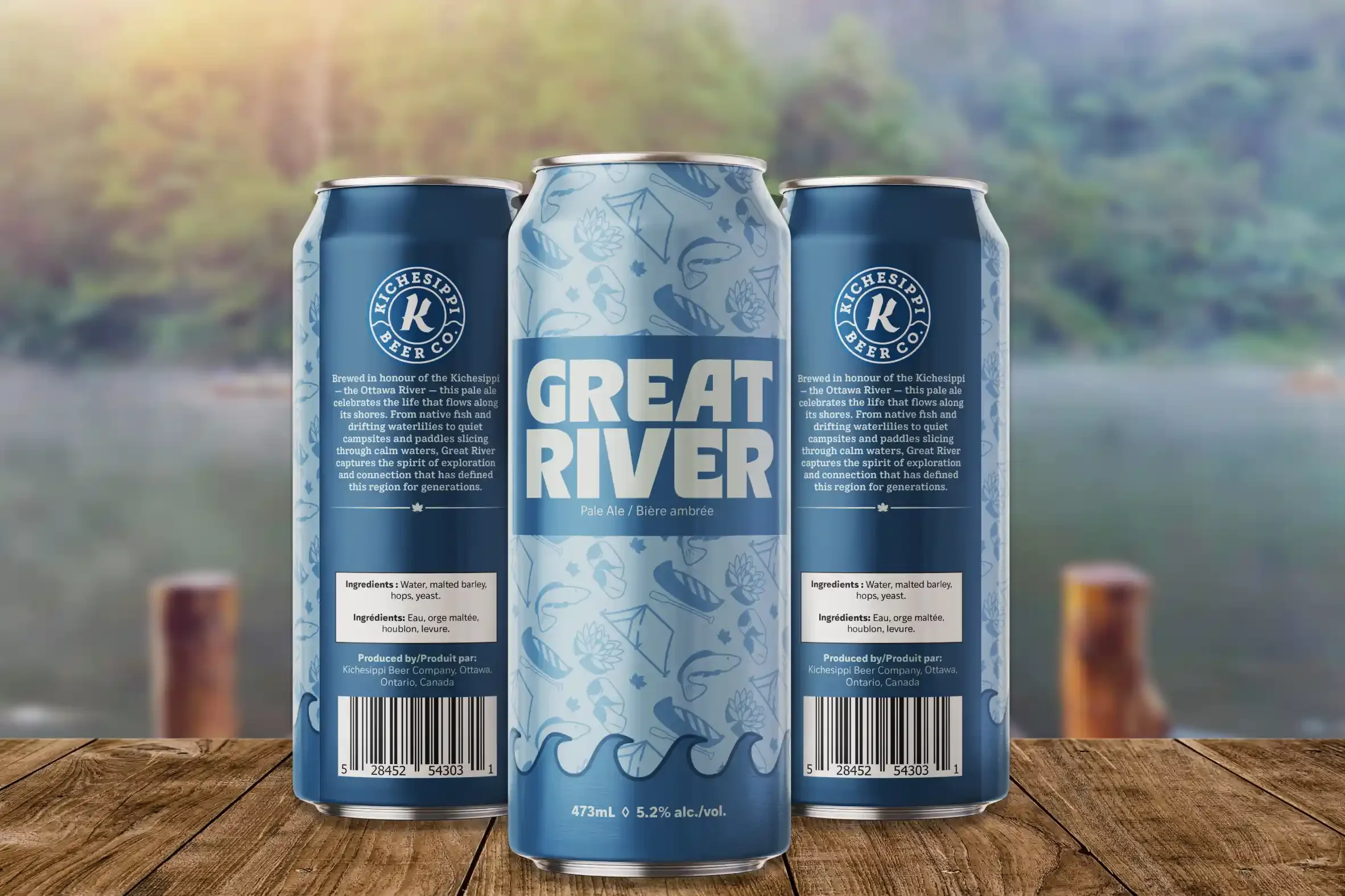
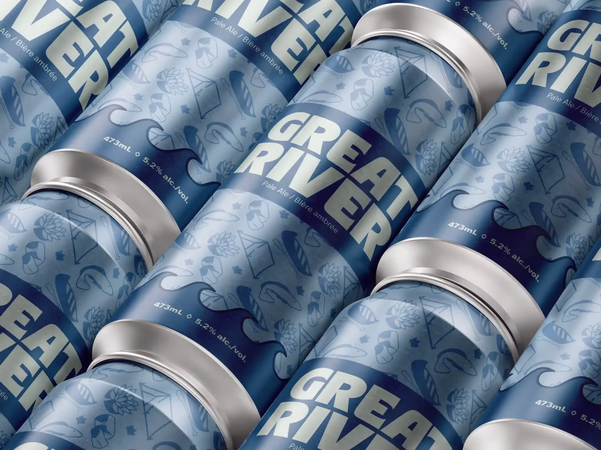
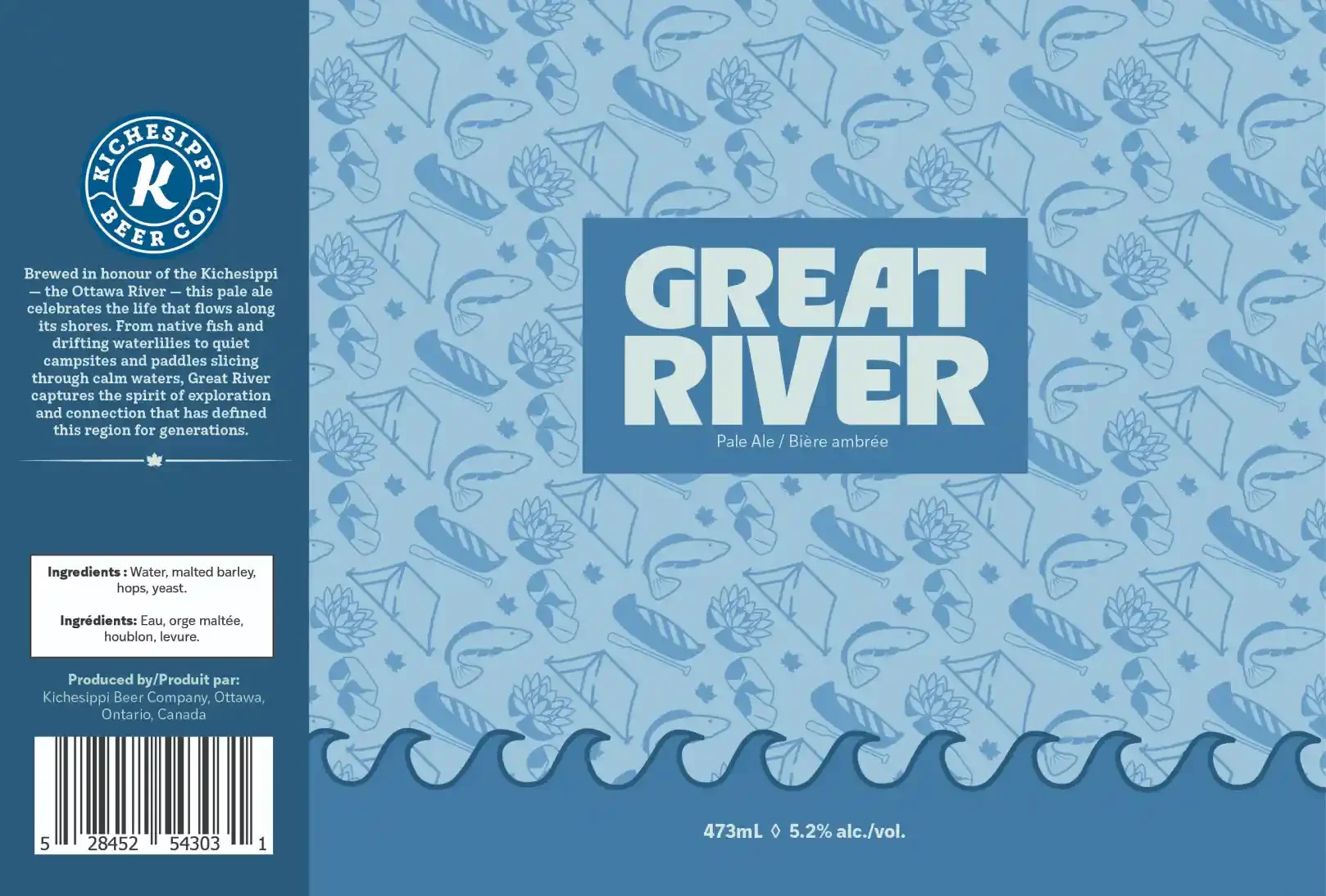
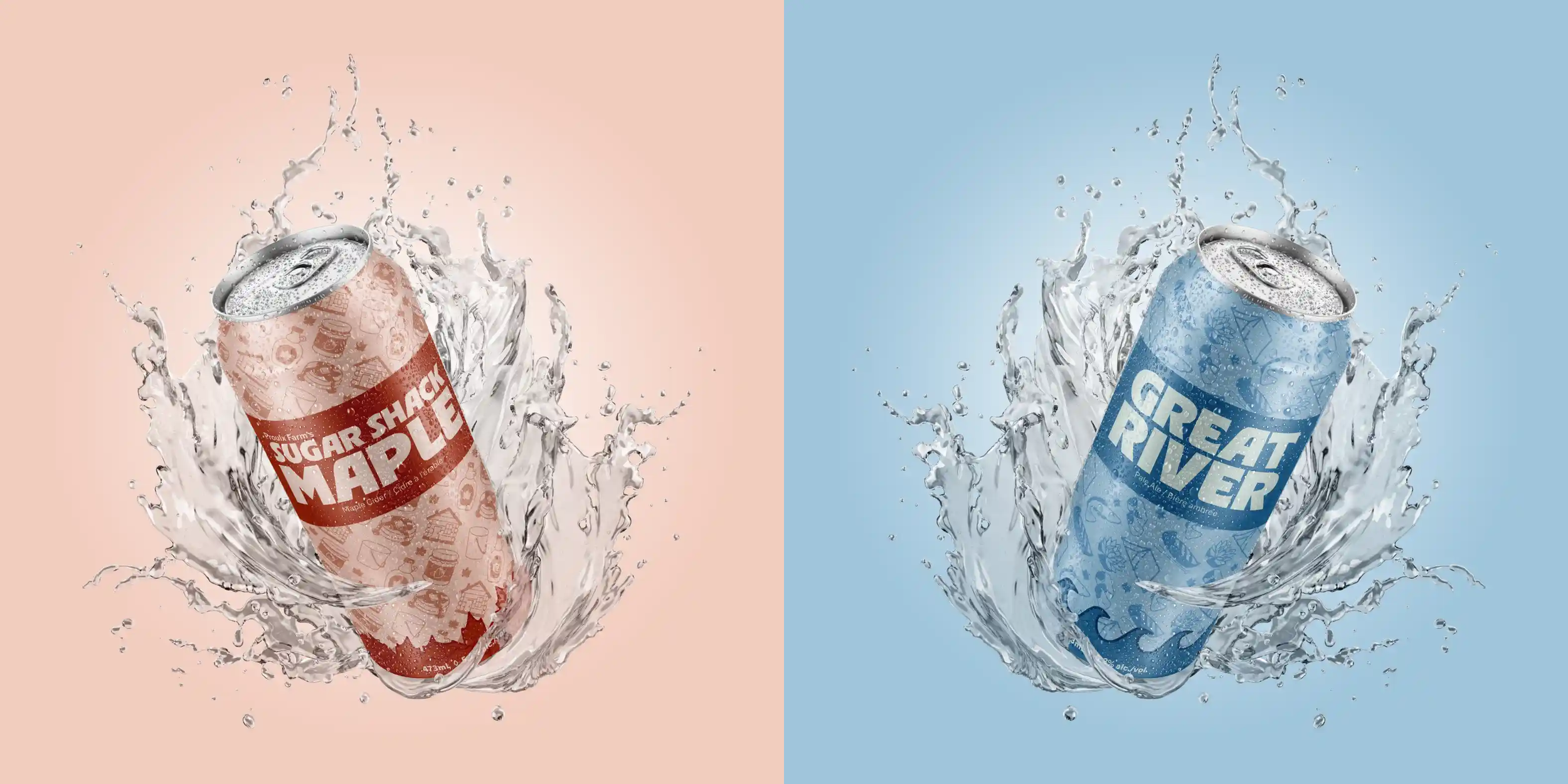
This project involved creating two original alcoholic beverage labels for a local Ottawa brewery. The goal was to design packaging that both fit the brewery’s existing brand and reflected the spirit of the city. I chose to design Proulx Farm’s Sugar Shack Maple Cider and Great River Pale Ale — two concepts inspired by Ottawa’s natural landscape and local traditions. The final designs are clean, cohesive, and engaging, each telling a story that connects the product to its roots in the region.


The Process
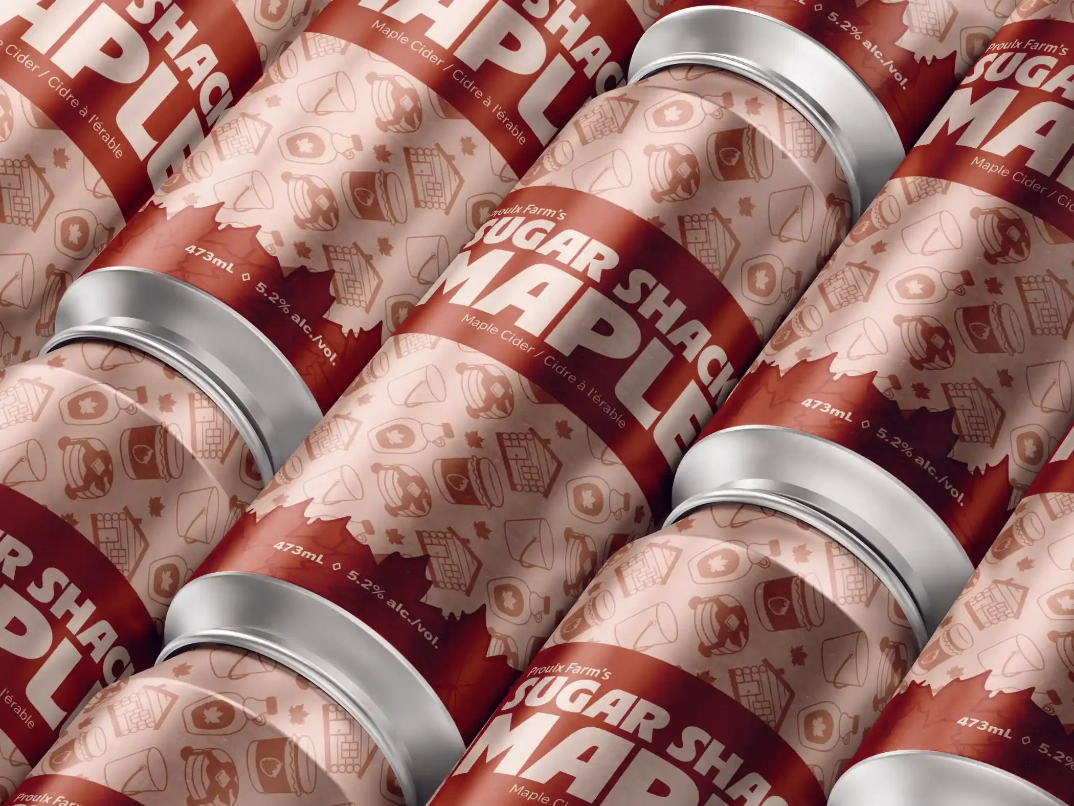
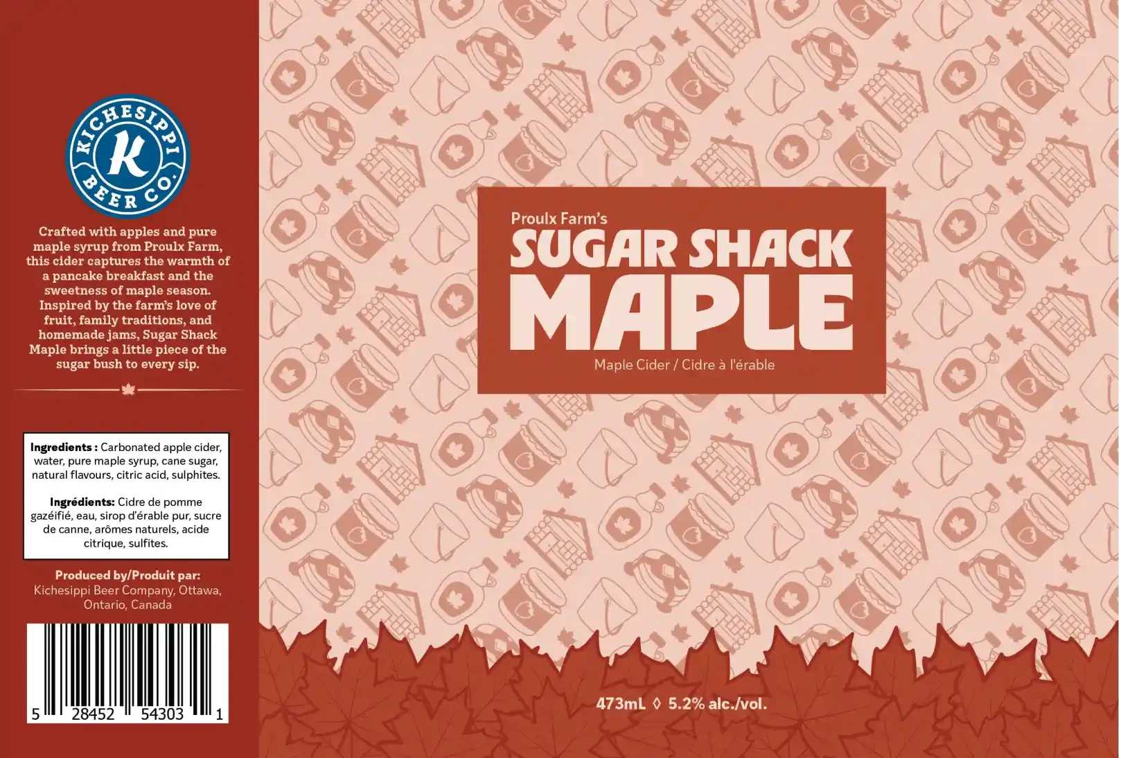
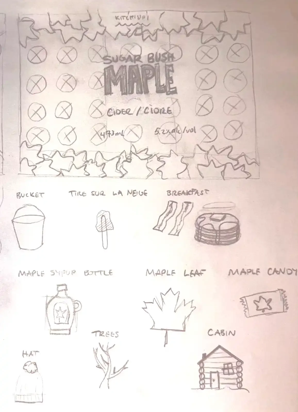
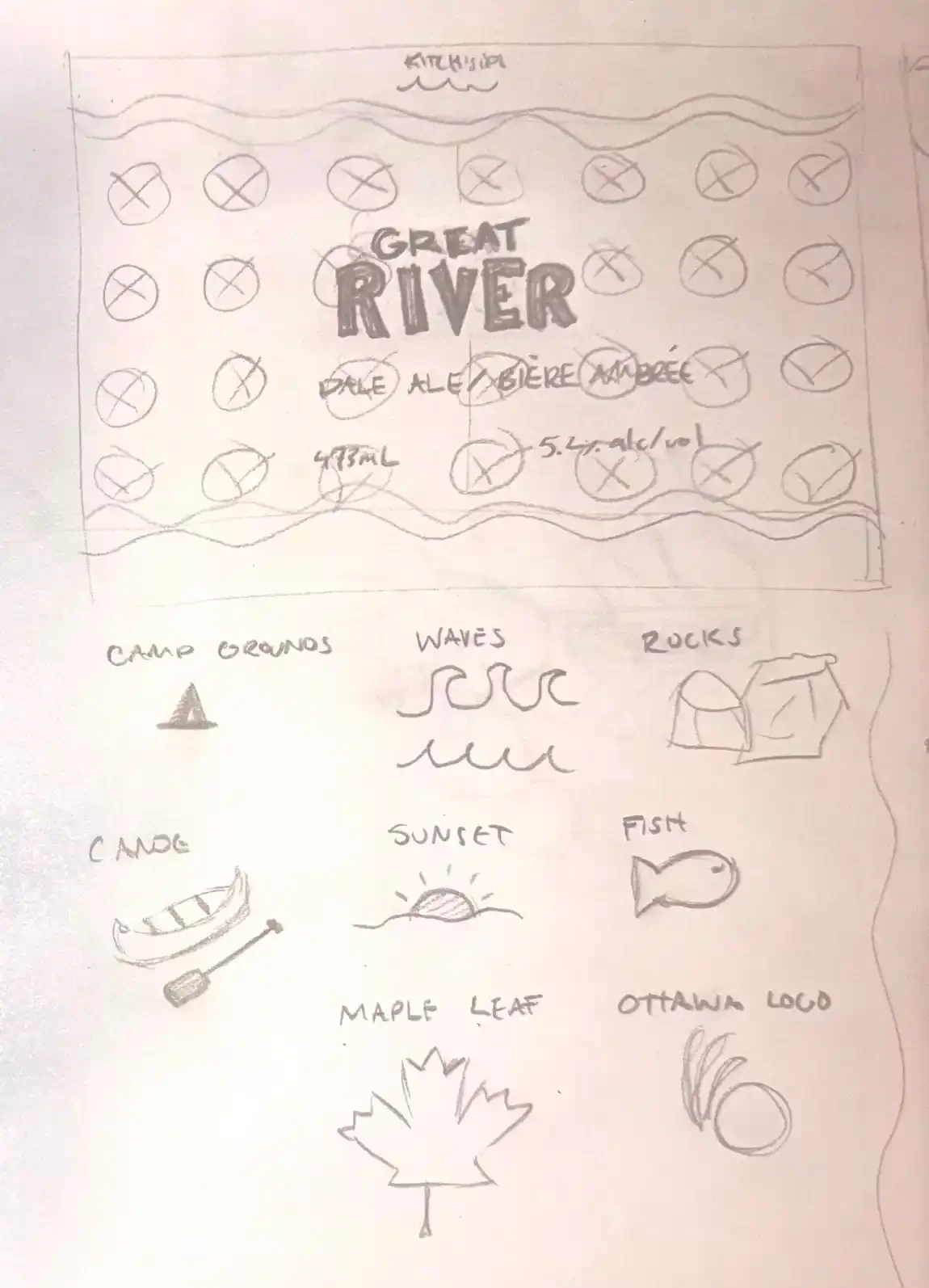
The process began with sketching and brainstorming visual concepts that reflected each beverage’s theme. Once I finalized my ideas, I moved into Adobe Illustrator to design the symbols and create custom patterns for each can. I selected color palettes that captured the tone of each drink — warm, rustic hues for the maple cider and cooler, natural tones for the pale ale. After assembling the designs, I refined them through feedback from my professor, made final adjustments, and produced realistic mockups to showcase how the labels would appear on actual cans.


The Challenge
One of the main challenges was striking the right balance between familiarity and originality — ensuring the designs felt connected to the brewery’s identity while still introducing something fresh. I also faced some technical hurdles in maintaining legibility within the limited color palette I chose, making sure that every symbol was both clear and visually distinct. Additionally, it was a challenge to fit all of the required information — such as barcodes, product details, and titles — while keeping the layout balanced and the graphics as the focal point.

The Solution & Outcome
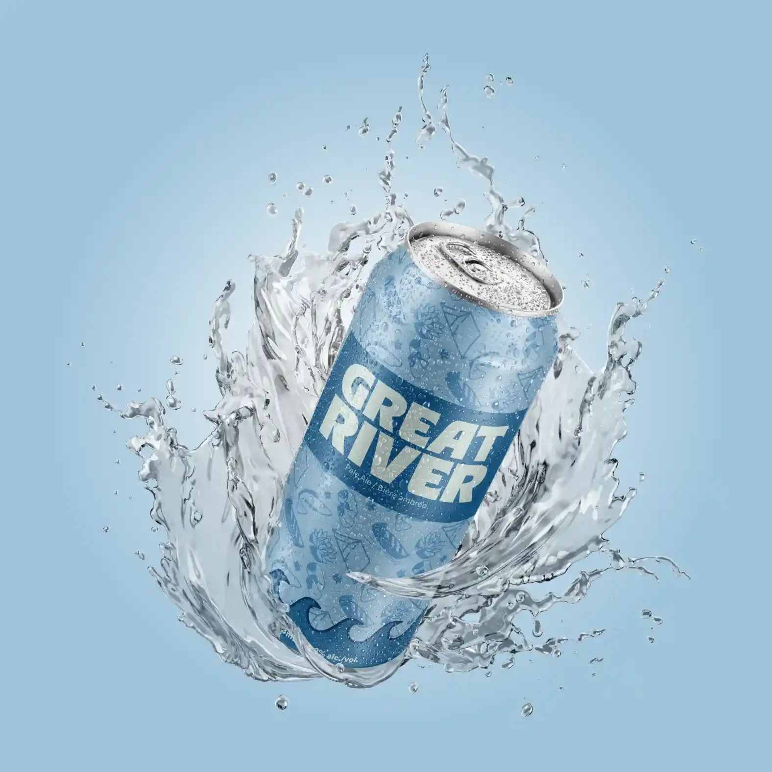
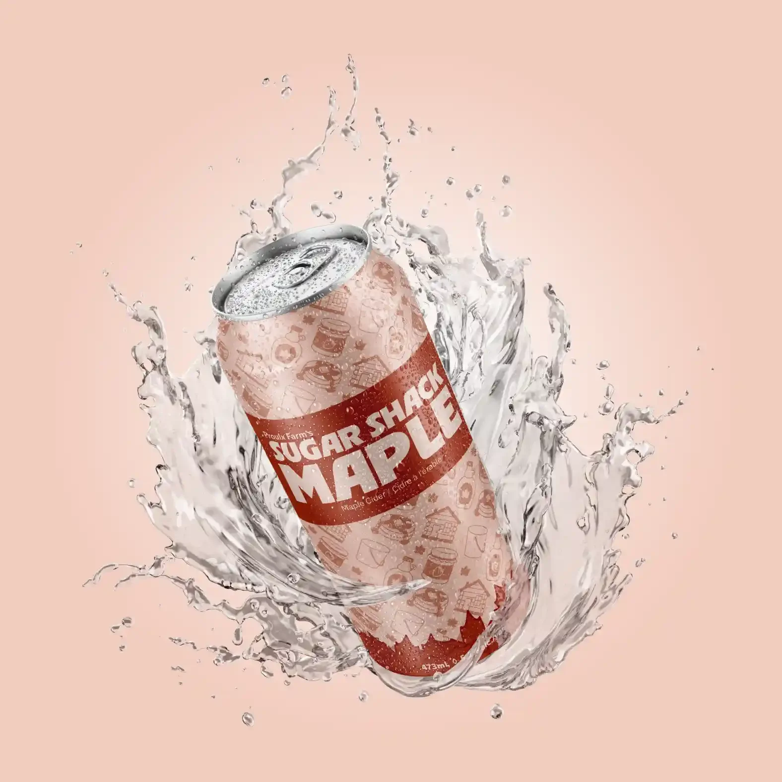
By experimenting with different layouts, color contrasts, and hierarchy, I was able to solve the legibility and spacing issues that arose during the design process. Careful adjustment of line weights, symbol placement, and text alignment helped create a balanced and polished final result. Each label captures a distinct mood — the Sugar Shack Maple Cider embodies warmth, tradition, and the cozy feeling of a sugar bush visit, while the Great River Pale Ale reflects the calm, refreshing essence of Ottawa’s waterways. Together, the two designs form a cohesive collection that feels authentic to both the brewery’s identity and the local culture. The project strengthened my skills in composition, branding, and print design, and gave me a deeper appreciation for how visual storytelling can bring a product — and a place — to life.